The Status of Penny Stocks Told By Three Key Charts
 What This Penny Stock Chart Means
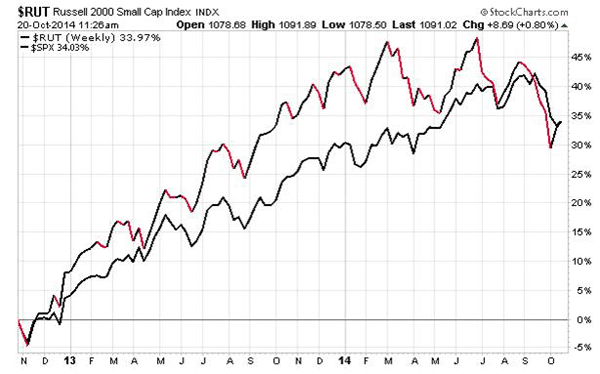
Take a quick look at this chart
Its the Russell 2000 index (a good measuring stick for small stocks in the market) vs the S&P 500 which as you know is a group of the largest companies out there.

The top line in red and black shows the weekly movements of the Russell 2000.
Youll notice that smaller stocks were easily beating bigger ones that is until this summer.
It makes sense in an economic recovery, smaller stocks tend to do better than larger stocks because of their size one big order, an increase in business, and/or improvements in margins tend to be magnified at the smaller companies.
So, while in a good economy, small stocks are great the inverse is also true.
In a bad economy, small stocks will be the hardest hit (and often the first). They have less of a business to fall back on, not as many customers or products, they dont have the assets or cash, or even the infrastructure to survive long bouts of economic problems.
That makes small stocks, penny stocks, the Canary in the coal mine.
Penny stocks are the early warning system for investors and they started giving us warning signs a few weeks back.
Another Penny Stock Chart Telling Us To Be Cautious!
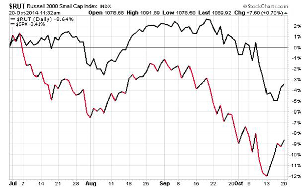
Take a look at this penny stock chart

These are the same two indexes the Russell 2000 and the S&P 500 as the first chart. But now were looking at them on a daily basis over the last 12 weeks or so.
As you can see since July the performance of the smaller companies has been falling investors are selling penny stocks every chance they get. And they are selling penny stocks faster than the bigger stocks.
Its a rotation into safety!
It means the market sees small stocks as very risky right now. The market is telling us theres a problem.
Whats the Problem In Penny Stocks? Another Penny Stock Chart
So, what problem is the market pointing to?
Maybe its the economy or the Fed trying to raise rates maybe its economic weakness in Asia or Europe or Ebola.
I dont know.
But these charts are important to watch they are either a warning sign that bigger drops are ahead or just an indicator that this is a great buying opportunity for penny stock investors.
Which is it?
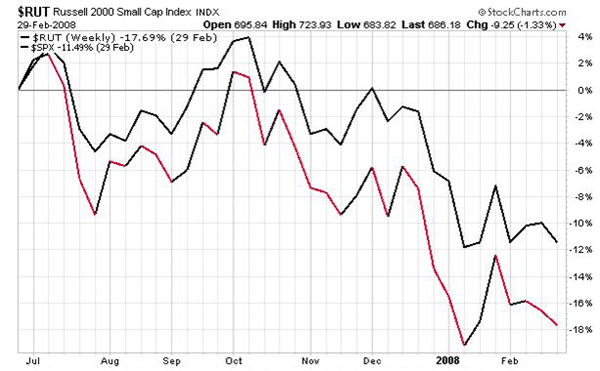
Take for example the market breakdown in 2007

As you can see clearly, in July of 2007, penny stocks started to UNDERPERFORM the market it was a clear sign that something bigger was at issue. It was a warning sign to get out.
But thats not always the case
Often times these selloffs rebound quickly with the Small cap stocks outperforming the markets.
What You Need To Do About These Penny Stock Charts
I know youre desperate for answers is this the start of something big or a buying opportunity?
For me, its a buying opportunity.
Why?
Because the last time we had a major market correction as bad as the one in 2007 2008 it was 1929. Huge market Depressions like that dont come along very often. So, Im playing the odds.
Im sharpening my pencil and starting to figure out what I want to buy.
Im going to watch for the divergence between the two indices to close back up and when I see that starting to happen, I know were back on the right foot!
However, Im still keeping my eye on these markets
If Ebola breaks out in the US, or Russia invades Europe, all bets are off.
Profitably Yours,
Penny Stock Research
Category: Breaking News


