Are These The Best NASDAQ Penny Stocks?
 Are You Watching These Penny Stock Charts!
Ok, let’s look back in time…
Not far, just go back with me about three months.
Back in early March, I wrote an important article about a particular penny stock chart every trader needed to watch. That article: What Stock Charts Technical Analysis Can Tell Us About The Penny Stock Markets touched on some important topics.
Here we are a few months later… and it’s time to refresh the chart and take a look.
If you remember… the best sources to track the overall performance of the penny stock market is the Russell 2000 index.
It’s not perfect… it tracks lots of stocks that are way too big for our penny stock investments.
However, it’s the closest thing we have to a penny stock index. And it has a long track record.
The Simple Way To Review Penny Stock Charts
As you know, there are thousands of ways to do technical analysis… and I like to keep it simple.
I watch the index and its 200-day moving average to track the overall trend in the market. And every few weeks, I look back at the data to make sure I didn’t miss anything.
Back in March, the 200-day moving average had just started trending higher…
The upslope was undeniable. After a few months of sideways trading… the trend ticked higher…
And I said, “We still have room to run on the markets for Penny Stocks!”
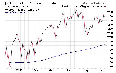
And I was right. The market climbed from 1228 to 1257, where it sits as I write this article. That’s a 2.3% gain in just a few months.
Just look at the chart…

So What’s This Penny Stock Chart Mean For The Future Of Penny Stocks?
Ask yourself, what’s the future of penny stocks?
Many will look at the chart and say, we’ve gotten ahead of ourselves. The market is too high and ready for a pullback.
Why? Because if you look at the index, it’s trading a solid 70 points above the 200-day moving average. Many may think that’s too much.
Are they right?
Maybe… maybe not.
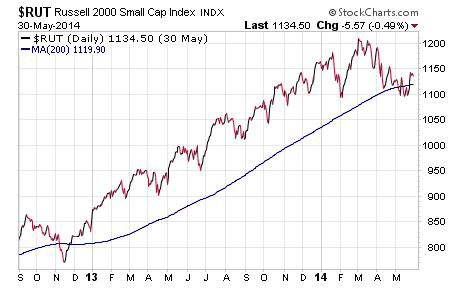
Just look at this $RUT chart from 2013.

As you can see, in early 2013, the index surged above the 200-day moving average and continued trading higher… and higher… and higher… for almost 16 months!
If you got scared out of stocks because the index was trading too high, you missed a massive run in penny stocks.
Might we see the same thing here?
It’s impossible to tell… but I will say this… the trend is higher and until we see it break down and head below the 200-day moving average… my bet is for penny stocks to continue to thrive!
What Do You Think?
You see the chart… you see the data and the news.
Do you think we’re poised for a pullback?
Or… are we going to surge higher?
What do you think? Let me know… comment on the blog below.
Good investing…
Brian Kent
Note: If you’re interested in learning more about Brian Kent’s Penny Stock All-Stars premium service… and learning about the stocks we’re trading for profit… you can get the inside scoop on penny stocks here.
Category: Trading Penny Stocks


